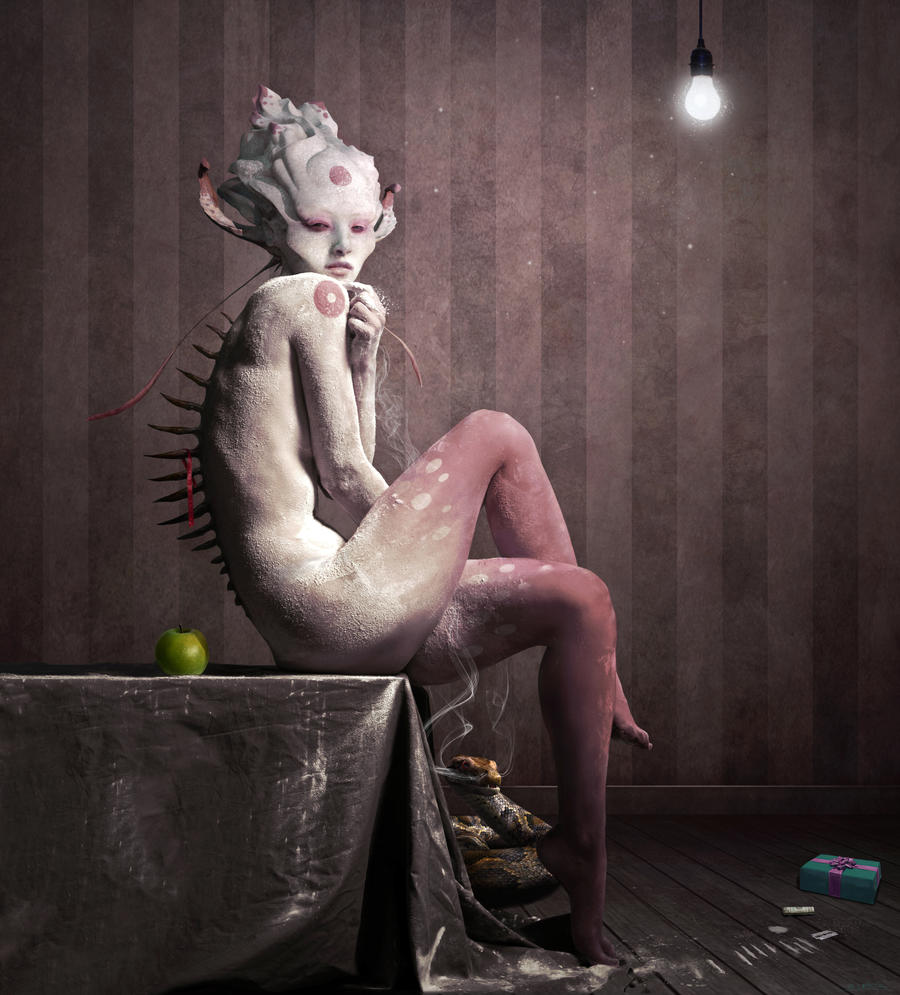
The full image of corpus Delicti, a personal work with a personal story. Inspired by Max Sauco and Joel Peter Witkin.
The hypothetical play with the title should provoke some thoughts about "what is the "piece of evidence" in the image, or better said if there was a crime, who´s the delinquent?
I wish you a nice time to find that out
Close up here:
Stock credits: Model: Istockphoto - Cevdet Gokhan Palas Room: ~AnneWillems Present: *ravenarcana Lightbulb ~doesnotexist & personal stock and brushes
I'm guessing the elements on this piece are all there for a reason, but I would rather give an opinion based primarily on the purely visual aspects rather than the meaning of the piece, since meaning *is* quite personal after all.
First of all, I must say that the photomanip technique you've used (if any ) is flawless. I also like the selection of the individual elements, like the spine blades, ribbon, apple, rolled dollar etc. I love the beautiful color contrast between the girl's figure, the ribbon and the apple, as well as the visual symmetry between the apple and the light bulb, and also the overall color scheme that -for me- flows quite nicely around the whole piece. I'm guessing that the gift box way right has this particular color as way of standing out? Which is all cool, except that it is very subtly portrayed. It's size is quite similar to the size of the apple and the bulb, so I'm guessing maybe you're trying to link the three items visually - and by extension in meaning? As far as symmetry goes, that works, though I would have liked to see a version with the gift box in color tones similar to the apple, since this could make it stand out more clearly too. The thing that "bugs" me though is the snake. Even though it's essentially in the center of your composition, framed as such by the girl's legs and the folds of the table-cloth, the fact that it has its own folds and patterns and the orangy color makes it "vanish" within the piece. Which is all cool if you intended it to be a ninja snake to begin with, but maybe it could also work if its body were less saturated and actual contrast were given to the smoking head instead? Since the head seems to be closer to the viewer than the rest of its coils as portrayed by the smoke drifting up between the girl's legs. Which also seems to give the piece a bit less depth than I would have expected. I'm saying this because this particular part of the pic (girl's legs, table-cloth folds, smoking snake) seems to be the most "loud" texture-wise compared to the rest of the pic which is much simpler, so I don't think much would be lost with less color anyway. Um. If that makes any sense to you. Depth of course, could also be achieved if there was a bit more contrast in your darker areas behind the gift box and in the bgr behind the girl and table. I would also like to see a version with just a bit of a blur in the bgr, but maybe you already have that. The preview is not all that big, so I can't really tell.
Regardless of all the technicalities, it is still beautifully made and I would still congratulate you on your vision. Well done and I hope this helps?
First of all, I must say that the photomanip technique you've used (if any
I love the beautiful color contrast between the girl's figure, the ribbon and the apple, as well as the visual symmetry between the apple and the light bulb, and also the overall color scheme that -for me- flows quite nicely around the whole piece.
I'm guessing that the gift box way right has this particular color as way of standing out? Which is all cool, except that it is very subtly portrayed. It's size is quite similar to the size of the apple and the bulb, so I'm guessing maybe you're trying to link the three items visually - and by extension in meaning? As far as symmetry goes, that works, though I would have liked to see a version with the gift box in color tones similar to the apple, since this could make it stand out more clearly too.
The thing that "bugs" me though is the snake. Even though it's essentially in the center of your composition, framed as such by the girl's legs and the folds of the table-cloth, the fact that it has its own folds and patterns and the orangy color makes it "vanish" within the piece. Which is all cool if you intended it to be a ninja snake to begin with, but maybe it could also work if its body were less saturated and actual contrast were given to the smoking head instead? Since the head seems to be closer to the viewer than the rest of its coils as portrayed by the smoke drifting up between the girl's legs. Which also seems to give the piece a bit less depth than I would have expected. I'm saying this because this particular part of the pic (girl's legs, table-cloth folds, smoking snake) seems to be the most "loud" texture-wise compared to the rest of the pic which is much simpler, so I don't think much would be lost with less color anyway. Um. If that makes any sense to you.
Depth of course, could also be achieved if there was a bit more contrast in your darker areas behind the gift box and in the bgr behind the girl and table. I would also like to see a version with just a bit of a blur in the bgr, but maybe you already have that. The preview is not all that big, so I can't really tell.
Regardless of all the technicalities, it is still beautifully made and I would still congratulate you on your vision.
Well done and I hope this helps?
The Artist has requested Critique on this Artwork
Please sign up or login to post a critique.